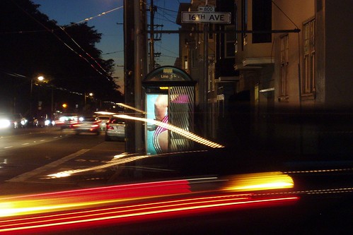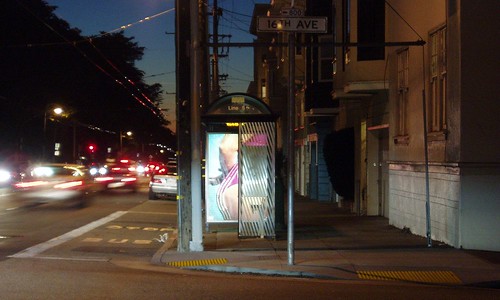
Sometimes the picture you get is cooler than the one you wanted to get. Case in point: coming home from work yesterday, I was struck by the burst of color in the bus shelter ad, so I set up a timed shot on the Gorillapod (on a conveniently located mailbox) to capture it. At just the wrong moment, a car came racing around the corner. I shot again, this time with no interference; that one is below the fold.
More...

I like this one too, but I like the accidental surrealism of the 'spoiled' shot a lot more. The violent streaks of light look like graffitti, like they're just superimposed on the shot; just as some elements can hold a picture together, I think the light streaks disassemble this one, making it look more like a collage of disparate elements than a photo. (Or maybe I'm overthinking, or maybe I have no idea what I'm talking about. In any case, I think it's cool.)


6 comments:
The movement, the play of colors (top image), puts Blue Rondo a La Turk on the internal jukebox. much appreciated.
I know exactly what you mean about accidental shots and the serendipity that sometimes happen when you open the shutter. I love that shot with the tail-light streak!
The other one is good, but really, the first one kills.
Oh, and Donna -- Blue Rondo a la Turk is my second-favorite cut from my very favorite album of all time. Great reference!
Cool effect. I like the little details.
Generik -- I saw Brubeck back in college (I think it was the the year dirt was invented). Brilliant and transporting! Your favorite cut?
My favorite cut is the most obvious one, Take Five. But I love every song on that album.
Post a Comment